Welcome to my first blog post! I have chosen the Unity September "Grateful Hearts" {be inspired} challenge to share with you all today. To be honest, I am not an avid challenge submitter, too much pressure, notorious procrastinator, indecisive design - etc, etc. Deb has been not-so-subtly hinting that I need to break the blog in and post something. Here goes...
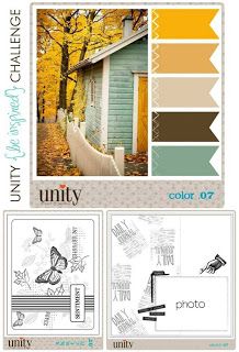
For this challenge, we needed to follow a specific color palette
and/or layout as show below. The colors selected this month are
fantastic, earthy, warm and so relaxing and calm.
I have tons of Unity stamps at home,
and I encourage anyone out there to check them out if you haven't seen
them before. Choices, choices - but in the end I chose a nature set call Gratitude = Joy as
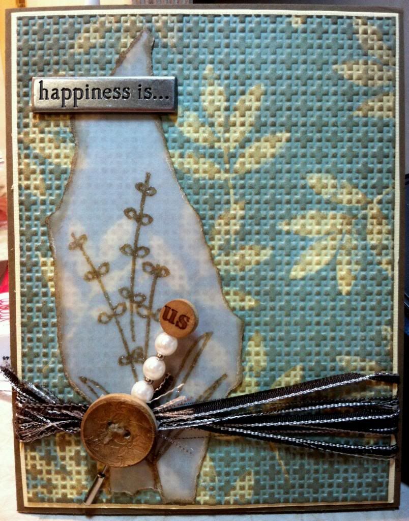
it seemed most appropriate for the topic this month. Here is the finished card.....
Not too bad for my first challenge in a LONG time. Perhaps not the best photo as I see there is a little bit of distortion in the center. Will try to clean up my photography techniques for the next one!!
Construction Details:
Stamp Set: Gratitude = Joy
Paper: Stampin' Up! Barely Banana, Cool Carribean & River Rock, Vellum
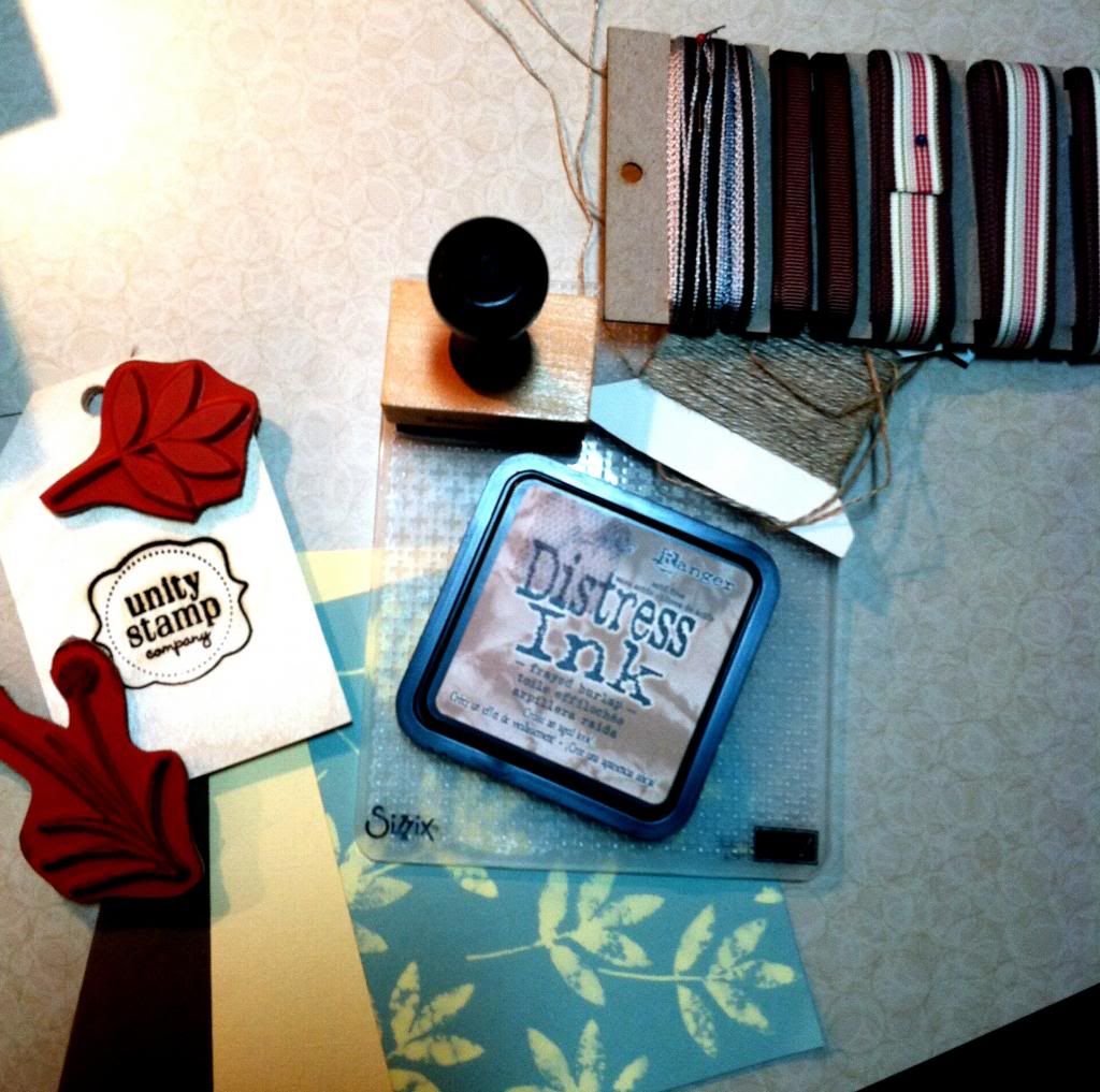
Ink: Ranger Distress Ink Frayed Burlap
Miscellaneous: Sizzix embossing folder, embossing powder, bleach, ribbon, etc.
Assembly:
I first started out stamping the leaf pattern on the background paper using the basic bleach technique which yielded the fantastic barely banana color on the paper. Then I ran it through the quilted embossing folder to give the background some texture. Using the frayed burlap distress ink, I inked across the background to give it a 3 dimensional look.
To make the vellum piece I stamped the willow/ leaf stamp in the distress ink and embossed with detail clear embossing powder. Halved the ribbon lengthwise & wrapped it around the matted background. Added the pin + beads & button along with the metal embellishment from my stash.
I hope you enjoyed this! It was a lot of fun to do!!
Amanda
Welcome to the Penny Black Challenge. Penny Black is a top favorite but I have had so few stamps that I never thought to try a challenge. Well, a lack of stamps problem can be solved......... :-). I used two Penny Black stamps on this image - Big Ben colored on Gina Kay with my copics and London Eye. Both stamps with Memento Tuxedo Black. My copic paper is Gina Kay. I bought the tags from Staples - really the best place to buy tags - volume for price!! Also on the tag are Post Card and London from Tim Holtz. Ribbon and Twine - SU!. The Tag is distressed with Tim Holtz. The filmstrip is Tim Holtz attached by the Tiny Attacher. The calendar is Tim Holtz Patterned Paper. My background patterned paper is stash and my solid paper is Bazzill. The camera is Tim Holtz Sizzix Movers and Shapers with Smooch Spritz in silver and gold. The green/burlap tag is Little Yellow Bicycle (I think?) and the sentiment is SU!
:-) Deb
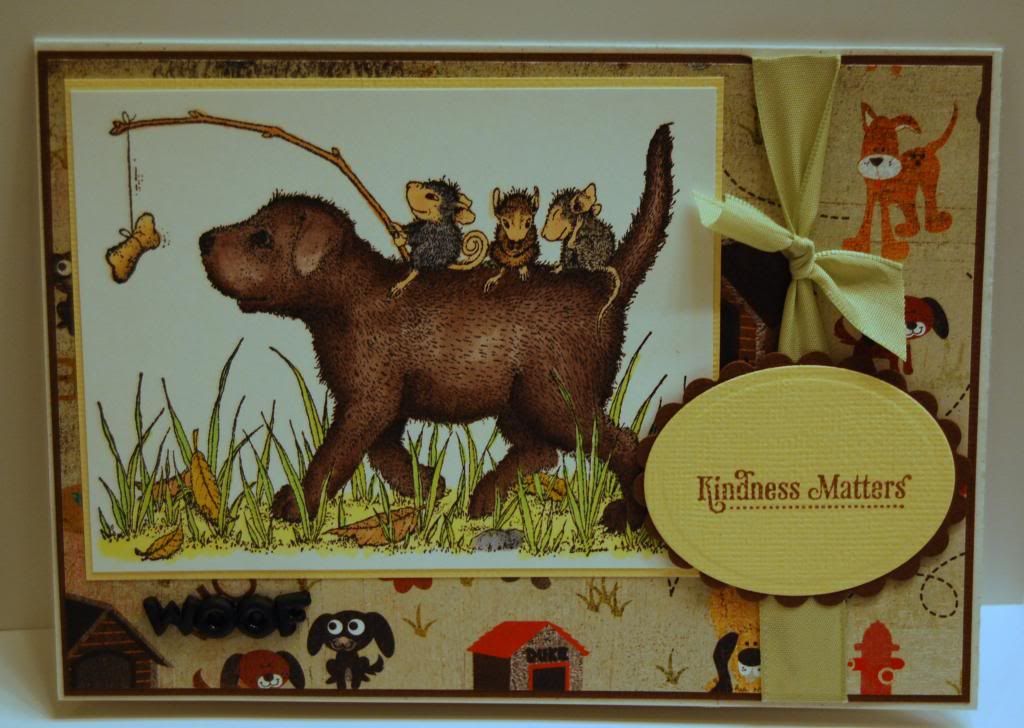
Transportation.......fun. I immediately thought of this image although I have few of the sliding, skating, and skiing images - I wasn't quite ready for winter. The image is "Are we there yet?". The dog is tough to color - the one I posted is my 2nd try. I colored the image with copics and used 3 different mouse colors - cool grays, warm grays, and my normal brown. The dog is colored with an E70's group. The solid cardstock is Bazill and the patterned cardstock is Basic Grey Max & Wishkers. The Ribbon and Sentiment are SU!. The sentiment was cut out with Nesties.
On a side note, I have to bit the bullet. I need an Ott Lite and a Photo Box for my pictures. I can't seem to take/edit a photo that I'm happy. It isn't really the money - it is the space. My craft area in my spare bedroom is packed and I have no room for anything big or bulky. I need to look for a collapsible photobox. So anyone ready through my post who has some ideas. Love to hear them.
:-( two weeks in a row I am too late to get in the challenge...oh well. I'm still posting on the blog!
:-) Deb
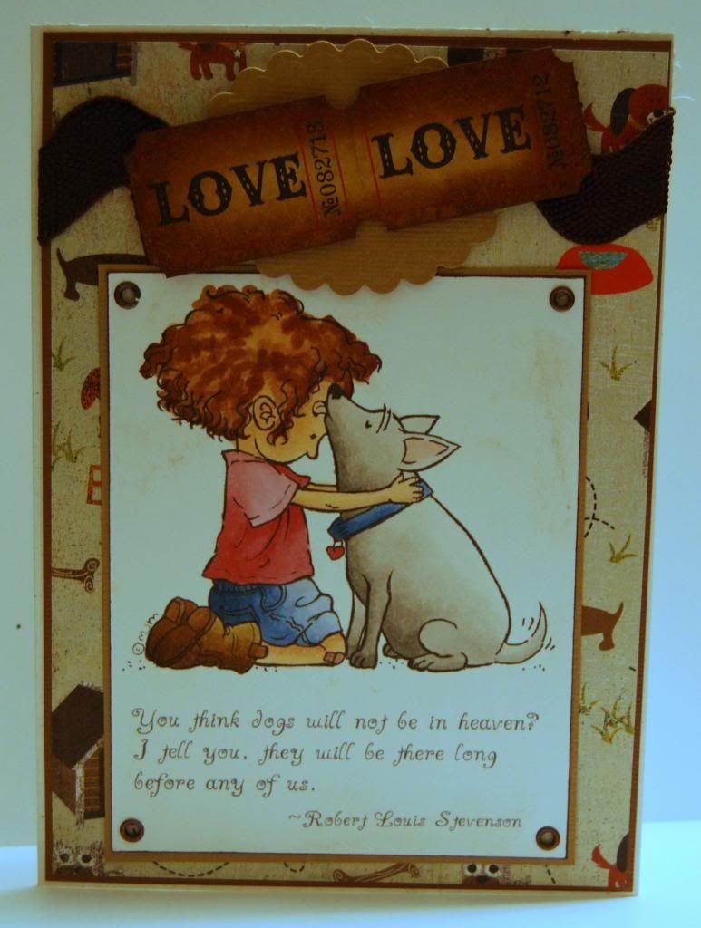
I think "Bronte Kisses" has to be one of my favorite - if not my #1 favorite of all Mo Manning images. I made this card for a friend who just lost their dog. I have stamped a sentiment inside from SU!. My copic paper is Gina Kay. The solid paper is AC Cardstock and the patterned paper is Basic Grey Max and Wiskers. The scalloped oval is a Nestie, the rickrack ribbon is stash, the eyelets are SU!, and the tickets are Tim Holtz/Distressed with Tim Holtz.
:-) Deb
Goodbye Summer was a FUN challenge. I knew immediately what image I wanted to use from Mo - "A Thousand Stars". One of my favorites. I colored the image with Copics. I tried my best to color and shade to appear like a bright moon was shining down on Bella and Bronte. The sentiment is House Mouse. The metal embellishment is CTMH. The patterned paper is from my stash and the vintage paper is Tim Holtz. The button is stash and the twine is SU!. I promised to give credit for the felt on Etsy but I can't remember where I bought it - still looking. The flowers were cut from a Tim Holtz die. I'm sad to say...I missed the opportunity to get this one loaded on the challenge web site. Next time....
:-) Deb